
Sea of Eyes
Pastel on paper
18 by 24 in
December 2021
This project is a collage of different eyes in pastel. It is meant to show unity among the eyes while capturing their unique emotion and appearance. My goal was to use the pastels the show depth and realism in the skin and structure of each eye.
Inspiration

My inspiration is Mary Cassatt, who was an American painter who specialized in pastels. She often drew children and was especially skilled at faces. Cassatt's work stuck out to me because of the way she layers colors to give the skin depth. When using pastels for realistic work, it is important to layer different colors, otherwise it looks plain and flat. The best pastel artists have mastered this technique. I also admire Cassatt's use of color, especially the way she isn't afraid to use many different colors that wouldn't be seen on the surface level of skin (like blues, purples, etc).
The Long Gloves, Mary Cassatt, 1889
Planning
|
The first step in planning was to gather a lot of pictures of eyes. Rather than finding these off the internet, I asked my friends to send me pictures or I took pictures in person. I tried to get a lot of different looking eyes in different positions; for example some were rounder, some were squinted, some were taken from the side, and some were taken from the front. Some were in shadow, and some had more highlights. I included two pictures of my own eyes as well. I enjoyed capturing emotion in the pictures of eyes, like happiness in smiling eyes. Some of the eyes I used are shown to the right. |
|

|
Next I sketched out some of the eyes that would be more difficult to draw so that I could practice getting the proportions right. This was crucial so they would look the best I could get them to look on the final piece. A lot of the eyes were in positions I had never drawn eyes in before, like the ones taken from above or below. I also needed to make sure the eyes had a very clear structure, which I fortunately know how to do because I've been drawing eyes for several years now. |

Finally I made a map of where each of the eyes were going to go. This map included circular objects that represented the eyes, labels of who's eye was who's, and a written color map of what colors were in the area surrounding each eye. The purpose of this was to make sure that skin tones wouldn't clash with the colors around it, since I would be blending all the skin together. I made the eyes different sizes and I also made some of the eyes tilted more to the left or right. All of this was to make the flow of the piece smooth and to enhance the unity between each of the eyes.
Process/Experimentation
|
|
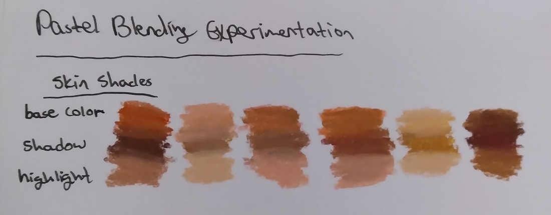
I started this project out by roughly sketching where I wanted each eye to go, referring to the map I made in my sketchbook. Then, I mapped out the colors that were written on the original map. I started with the darker tones, because pastel artists layer many colors on top of the original layer, starting with the darkest colors. I also layered the most saturated colors. Looking at my inspiration, the undertones of saturated color are very obvious, and it is what creates a realistic skin texture.
|


|
Pastels are messy, so I had to also plan out where I wanted to start and how I was going to finish the piece with the least smudging possible. I am left handed, so I started in the bottom right corner. I focused all my attention on one eye at a time, rather than jumping around, to keep organized and to bring a unique look to each individual eye. The first eye I did was in the rightmost corner. I left this one mostly unfinished, because I knew that dust from the drawings above it would cover it and ruin the layer. I needed to save the topmost layer and details for after the piece was completed. This strategic approach is rare among my art, because I often dive in and work all over the place. But based on past experiences with pastels, strategic planning is of utmost importance. |
|
|
|
I developed a clear process for each eye quickly, and it can be seen clearly in the slideshow to the right with my friend Bunny's eye. I begin with dark brown and black tone around the eye shape and wherever there are dark shadows. Bunny's iris has green and blue shades, so I used a saturated olive green and light blue for this layer. Then, I do some shading on the waterline, and add in the pinks that are in the corners of the eyes (some eyes have more pink than others). Then, I look for the undertones in the whites of the eye. To make it look most realistic, it is very important to know that the eye whites aren't purely white; they often have undertones of pink, yellow, blue, and gray (when in shadow). The eye references need to be studied carefully to see these undertones. I apply these colors on the first layer of the drawing. Once the entire eye is mapped out in color, all that is left is blending. I do this with a base color (in shadow areas, it is usually brown. For the eye whites, it is white, and for Bunny's eye, it was tan). I blend using a combination of hatching in textured areas and soft circular motions to make the drawing look smooth.
|
|
My friend Hamilton's eye was one of my favorites to draw, because the reference photo I took was from up, so you can see his eyebrow coming over the top of his eye. His eye and skin is very light, and lighter skin tends to have cooler undertones (because it is easier to see veins). The skin around the eye especially is very thin, so there are often prominent veins and patches of color. After blending the eye, I add the details that make it look real, and most of these are highlights. Since eyes have a layer of water over them, the light reflects off of them and there is a catchlight, as well as some highlights visible in the eye whites. In the corners of the eyes, there are often sharp highlights as well, do to the irregularly shaped muscles in the eye socket. |
|
|
As I got further along in the project, I started to blend the skin together to connect the eyes together. This showed the unity of the eyes and brought out the theme of the project. As I went along I found that the most realistic looking eyes did not have white eye whites, they were either a light gray or a beige color. I added in the veins of the eyes in pink or red depending on how prominent they were in the photo. |
|


|
|
Finally I added the eyelashes in. I ordered a thin pastel pencil to use for this, but it didn't come in time so I had to use my thick pastels carefully to make thin lines. For light eyelashes, I used brown pastel. For dark eyelashes, I used black and for eyelashes the light was reflecting off of I used white. I have a white chalk pencil that I used to ensure that the lines would be thin enough. I was able to work with the pastels to make thin lines by making soft, quick streaks. I think it would have looked better if I had used a pastel pencil, however. |
Compare and Contrast

Sea of Eyes, 2021
Comparing:
- Both pieces use hatching as a way of shading, and blend the colors with lines of pigment without entirely mixing the colors together to give the pieces an impressionistic look in some areas. - Both pieces have a bottom layer of saturated color and a top layer of less saturated color that gives the skin depth. - Both pieces have a focus on facial features, which are captured in extensive detail to add meaning to the piece. - Both pieces use pastel to give depth to the skin, because this is a medium that works well for skin and can make it look extremely realistic and lifelike. |

The Long Gloves, Mary Cassatt, 1889
Contrasting:
- Cassatt uses sharp black lines in some areas to outline her piece and show dark shadows more impressionistically. My piece also has black lines, but they are more blended out to bring out an aspect of realism. - Cassatt's piece appears unfinished in some areas in order to draw the focus to the face, and to see each of the layers of color and how they interact with the finished parts. My piece looks finished to show realism. - Cassatt's piece has an obvious point of focus (the face) and the eye is immediately drawn to it when viewing the piece. My piece does not have a specific point of focus; causing the eye to jump around the piece and see how it works together as a whole. |
Reflection
I am incredibly proud of how this project turned out. I think I definitely achieved my goal of giving the eyes depth and structure. I learned to better work with pastels through my use color and blending techniques. Specifically, I learned which colors work well being blended together and how to use saturated base colors to blend out with less saturated colors. My favorite part about using the pastels was the layers of color and how it gives the piece so much more depth than any other media I've worked with. The thing I struggled with most was probably the mess that the pastels made and how easy it was to smudge the work. I also struggled with the spacing between each of the eyes and how to correctly blend the skin tones together to unify them. Overall I am very impressed with the final piece and I believe I enhanced my skill in working with pastels.
Bibliography
Allen, Lily. “Connecting with Mary Cassatt’s Pastels | the Huntington.” The Huntington, 2021, https://www.huntington.org/verso/2021/03/connecting-mary-cassatts-pastels.
Sibley, Gail. “Comments on: Delighting in ‘The Long Gloves’ by Mary Cassatt.” Howtopastel.com, 22 Dec. 2015, https://www.howtopastel.com/2015/12/delighting-in-the-long-gloves-by-mary-cassatt/feed/.
Sibley, Gail. “Comments on: Delighting in ‘The Long Gloves’ by Mary Cassatt.” Howtopastel.com, 22 Dec. 2015, https://www.howtopastel.com/2015/12/delighting-in-the-long-gloves-by-mary-cassatt/feed/.
